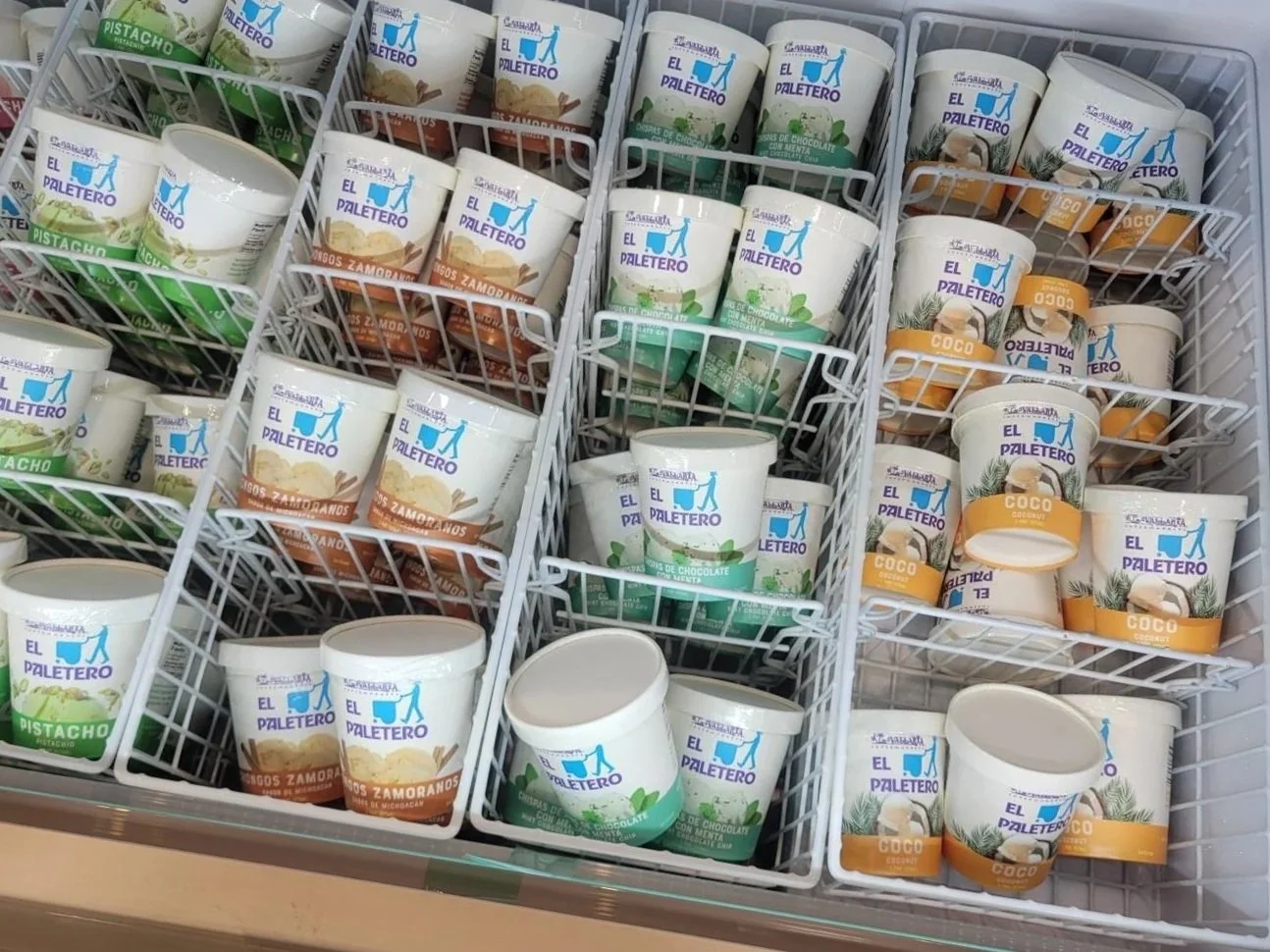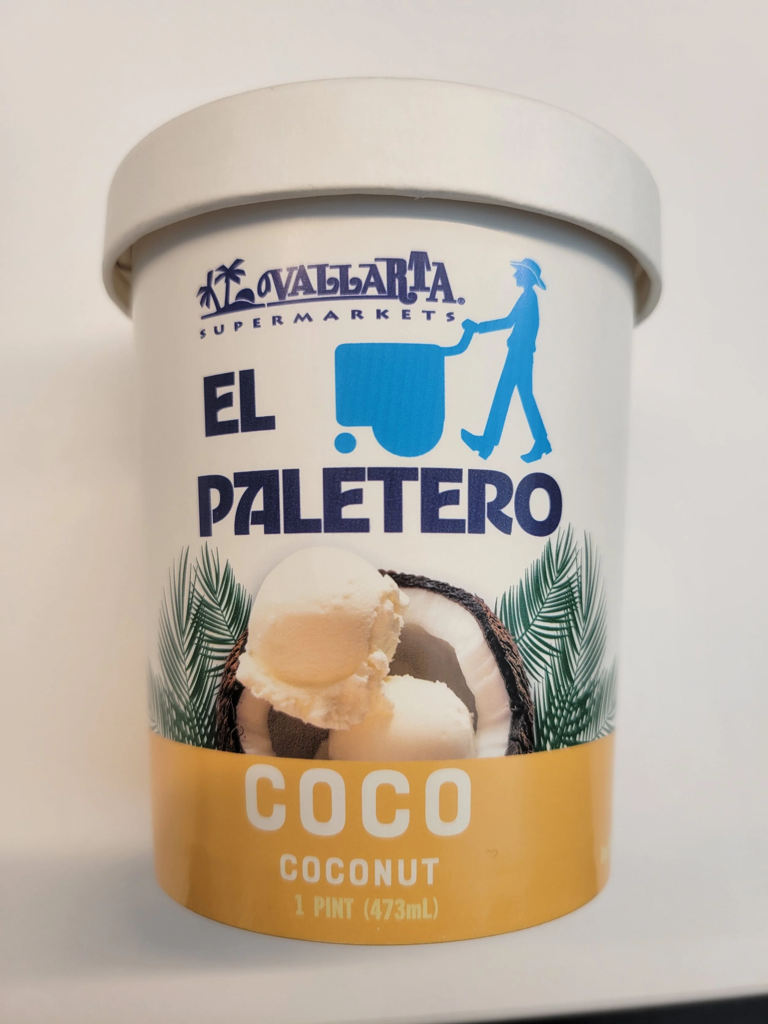
El Paletero Ice Cream & Freezer Decal
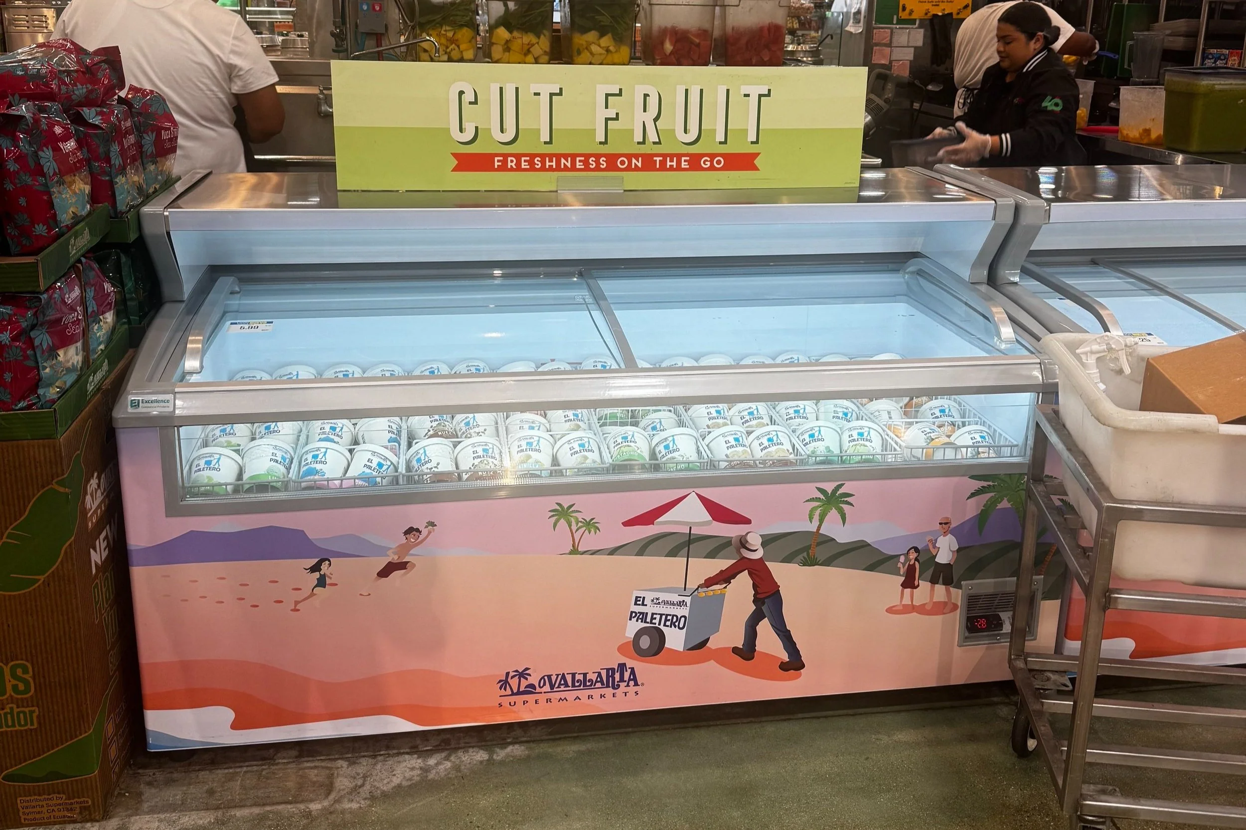
Final Decal Design


Sketch Explorations
I truly wanted to capture the nostalgia of the local paletero on a day at the park, or a day at the beach. No matter the weather el paletero always shows up to make the day better.


Initial Designs
These first two design directions emerged before the product even had a finalized name or logo, leaving every aspect of the brand open for exploration. This ambiguity created space to push ideas further and define what the identity could become.
For the first concept, I leaned into a playful, youthful aesthetic inspired by my memories of the circus growing up; bright, energetic, and slightly nostalgic. I wanted it to feel immersive and full of personality, capturing a sense of excitement and wonder.
In contrast, the second direction explored a more refined and elevated visual language. On large-scale brand projects like this, stakeholders often encourage broad exploration early on, allowing us to test the full range of what the brand could be before narrowing in.
The final direction ultimately landed on a balance between nostalgia and sophistication. Elements from the initial concepts carried through, but were refined and built upon to create a more cohesive and mature brand expression.
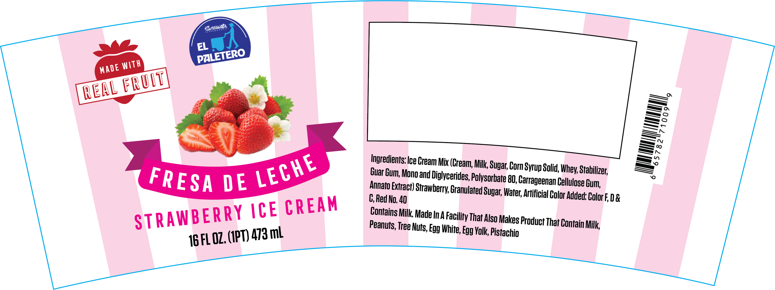
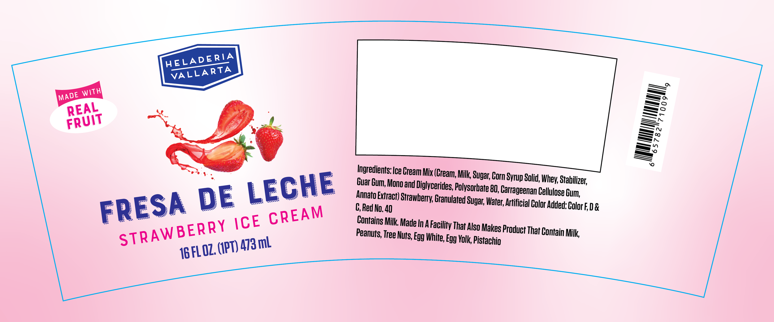
Final Packaging Design