
Sour Cream Product Packaging
Initial Designs
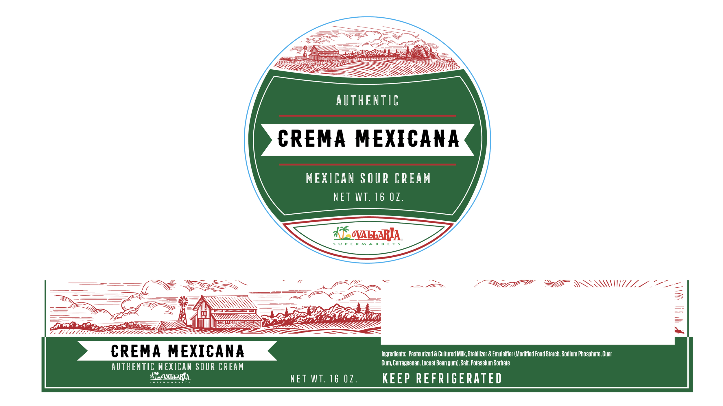
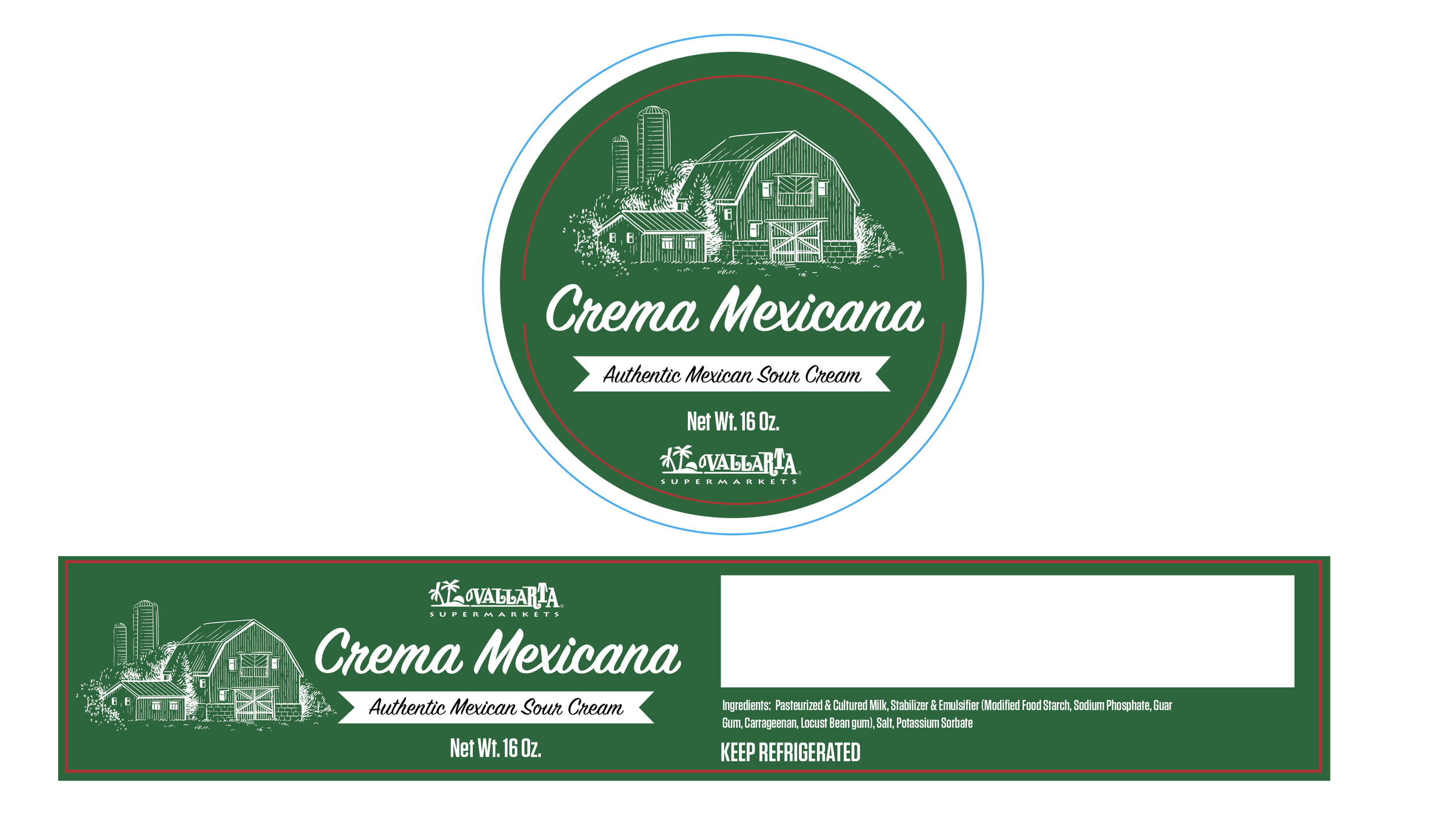
For the initial concepts, I drew from each country’s flag as a foundation for the color palette, using those cues to ground the designs in a sense of origin. With no defined creative direction, I intentionally explored two contrasting approaches: one with a more artisanal, crafted feel, and another with a rustic, tactile aesthetic.
The rustic direction resonated most with leadership, particularly the emphasis on burlap textures and a more grounded, heritage-inspired look. From there, I refined that concept into the final design system.
The final executions remained largely consistent in structure, with color variations used to distinguish between different recipes while maintaining a cohesive visual identity.
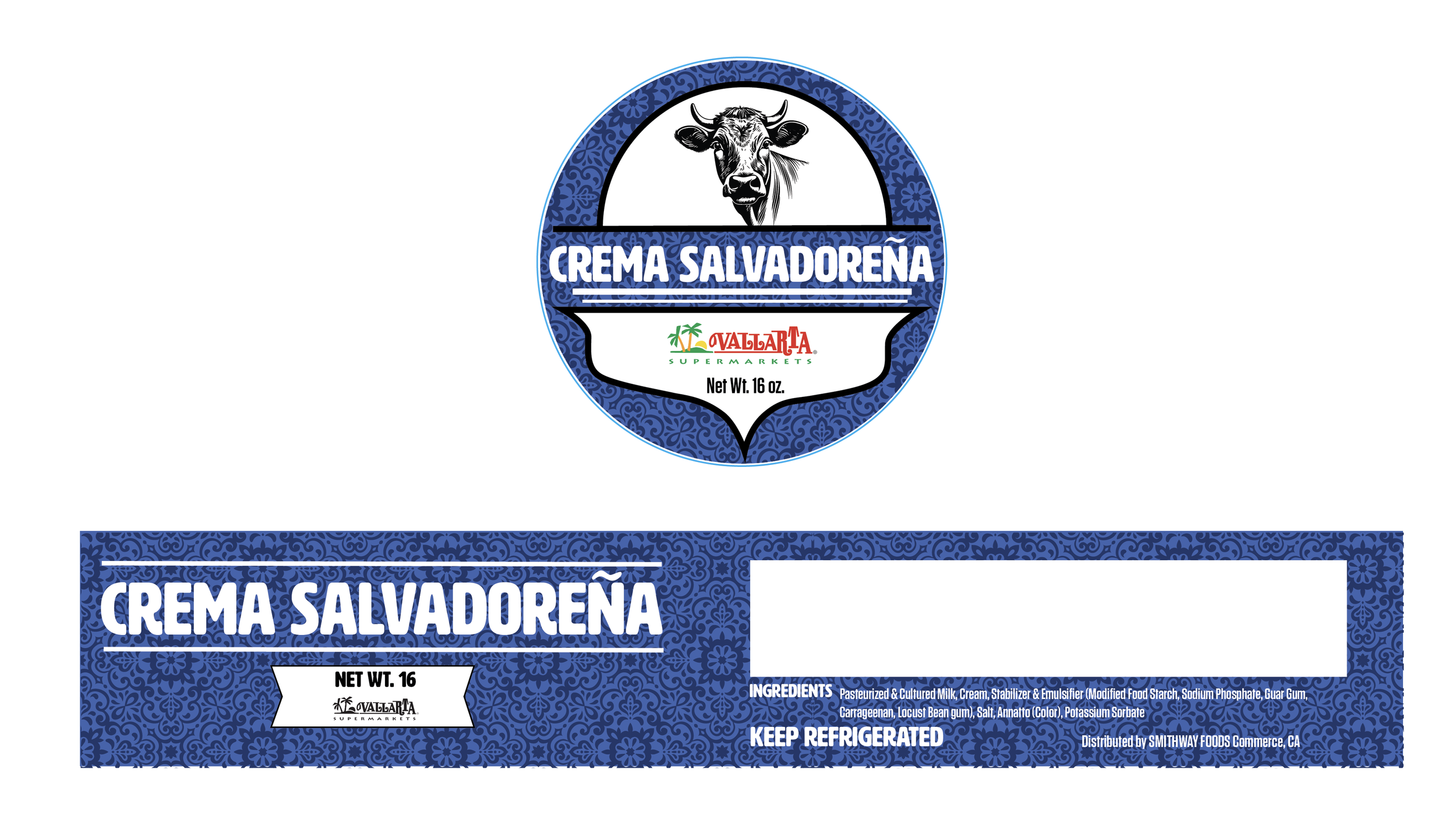
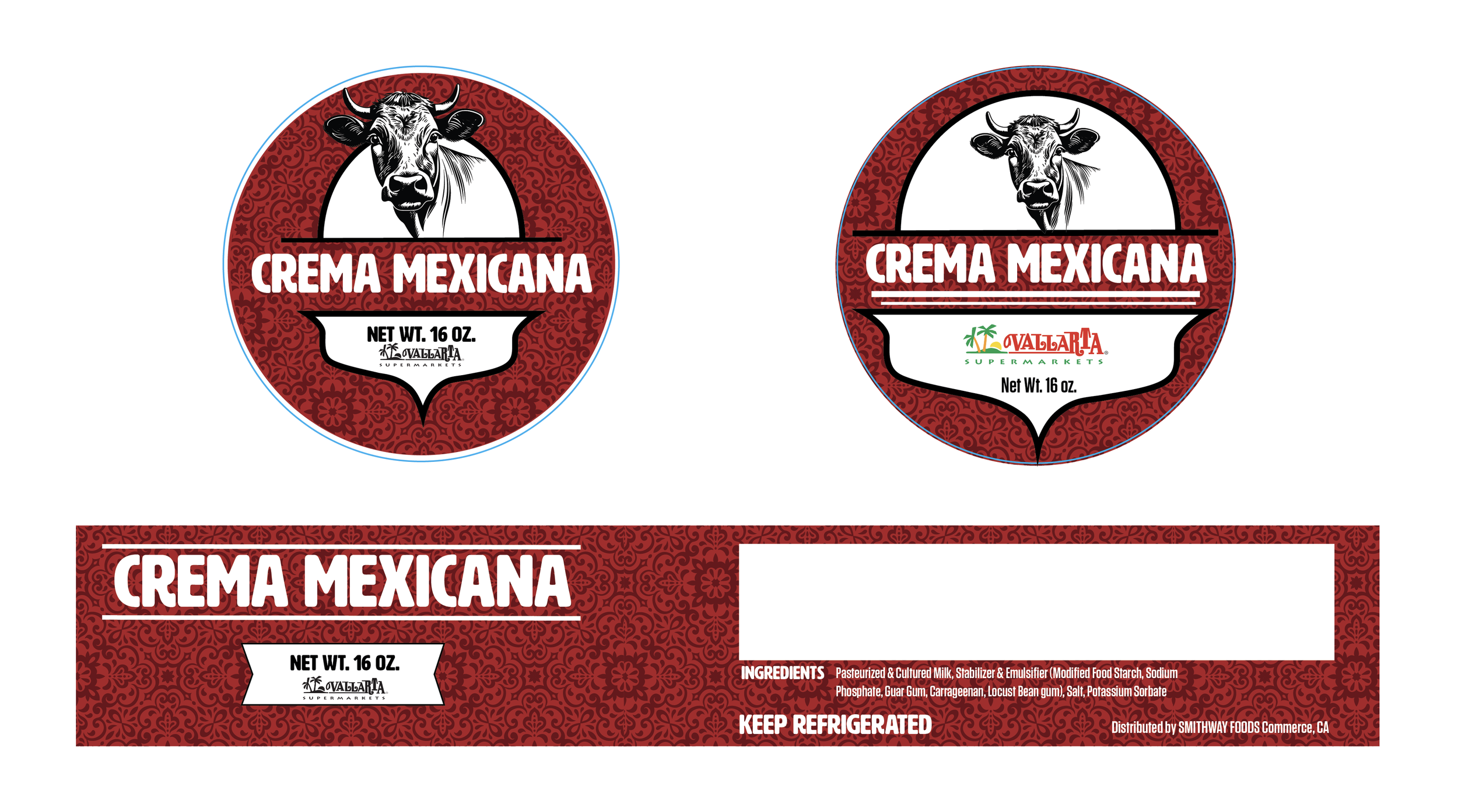
Final Design


